SIBEL for Sinelco
Inspire your Style - New branding & Packaging Architecture for Sibel
Sinelco is an international market leader as a manufacturer of quality hair and beauty products. They provide professional material for hairdressers and beauticians worldwide, with a wide range of products containing over 4800 sku’s.
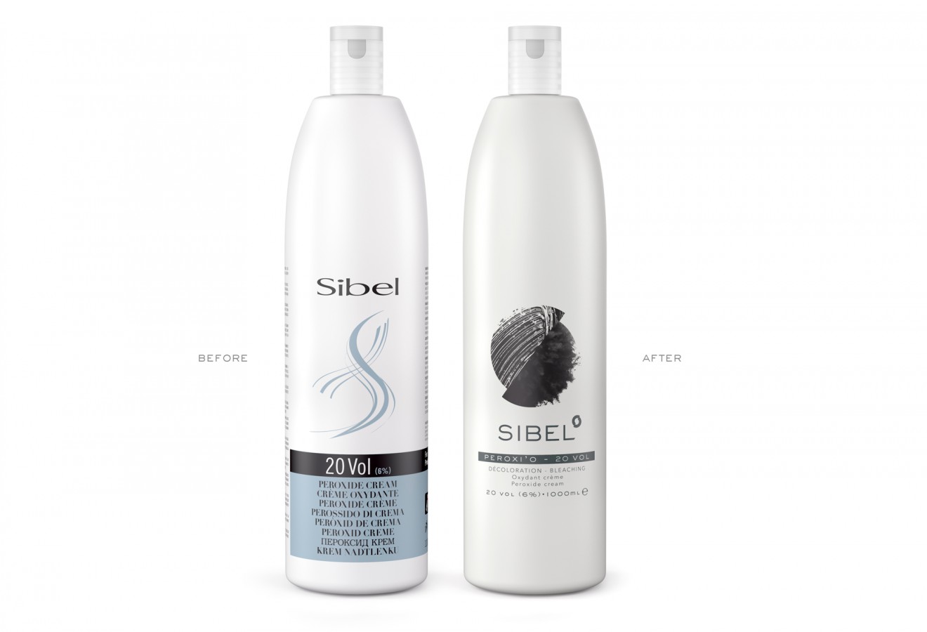
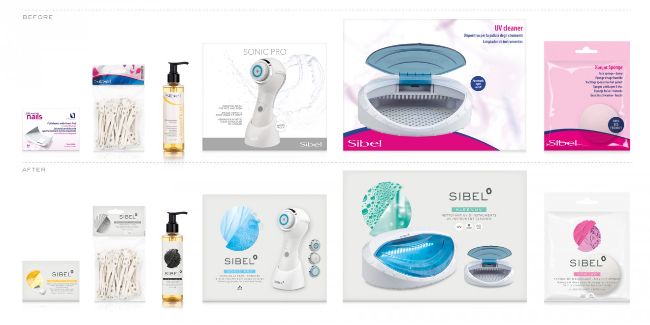
An important umbrella brand within their company portfolio is Sibel, with references in both Hair and Beauty. Up until now, the Sibel brand has a growing reputation related to trusted quality, traditional heritage and a universal expertise. However, this consumer and client perception is not reflected through their branding and packaging design. After expanding their architecture organically over many years across a large variety of subranges and sub-brands, the brand has become fragmented and unclear. Their instore presence through packaging was also inefficient, unrecognizable and old fashioned. Considering Sibel was required to compete against many iconic brands such as Wella, Loreal and Schwarzkopf, there was much work to be done.
Quatre Mains was asked to re-image the Sibel’s mother brand, to redesign its subcategories, create a new inspiring packaging architecture and provide a guideline for a further roll out of the entire beauty and hair range.
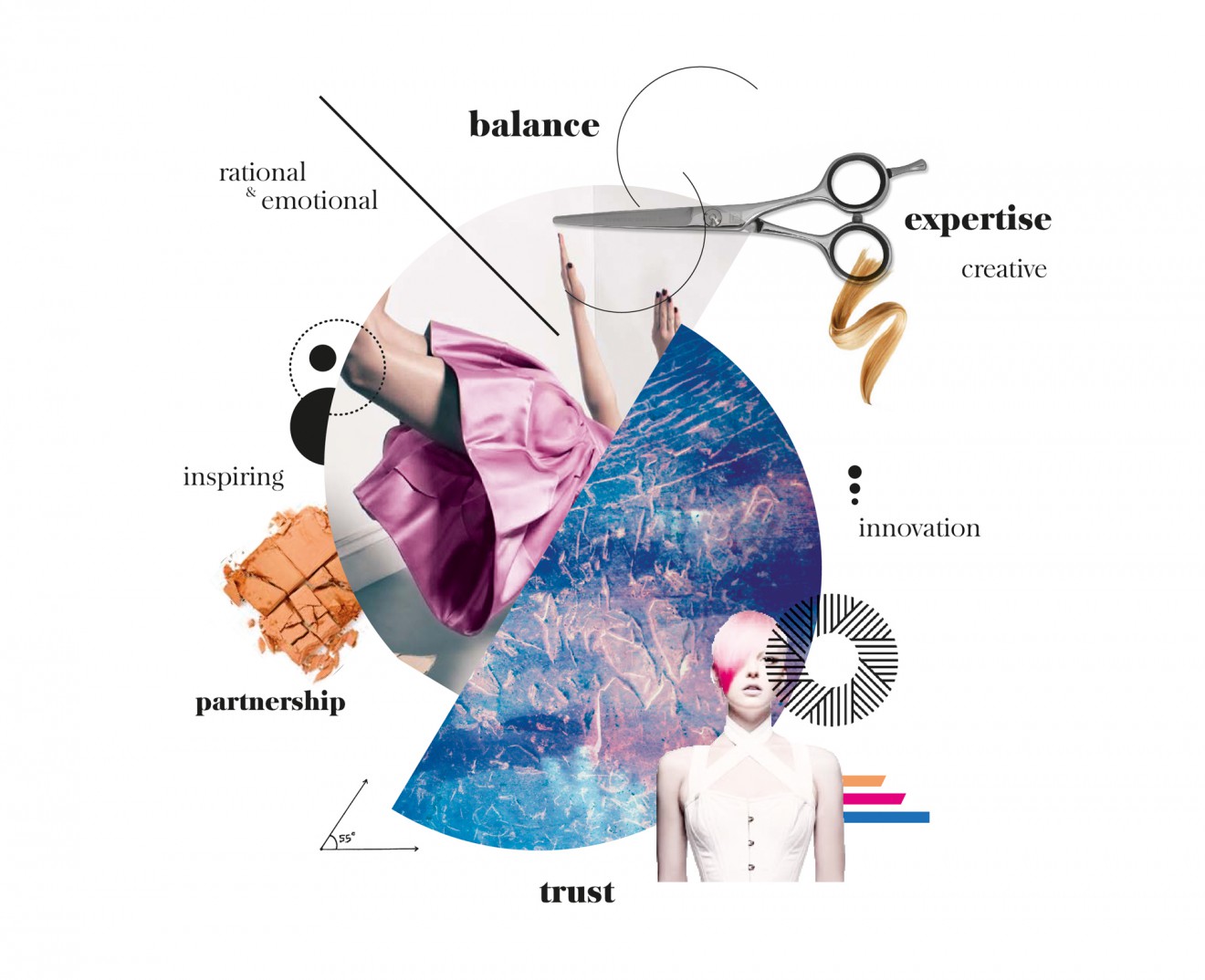
Our goal was to create a branding with meaning that combines Sibel’s qualities of today with inspiration for tomorrow. To create a professional image that attracts professional people in search of the new. This should underpin and be supported with a new inspiring packaging architecture that is impactful, efficient and effective. Most of all our mission was to visualize the quality perception Sibel’s consumers already have today and turn Sibel into a proud, innovative brand.
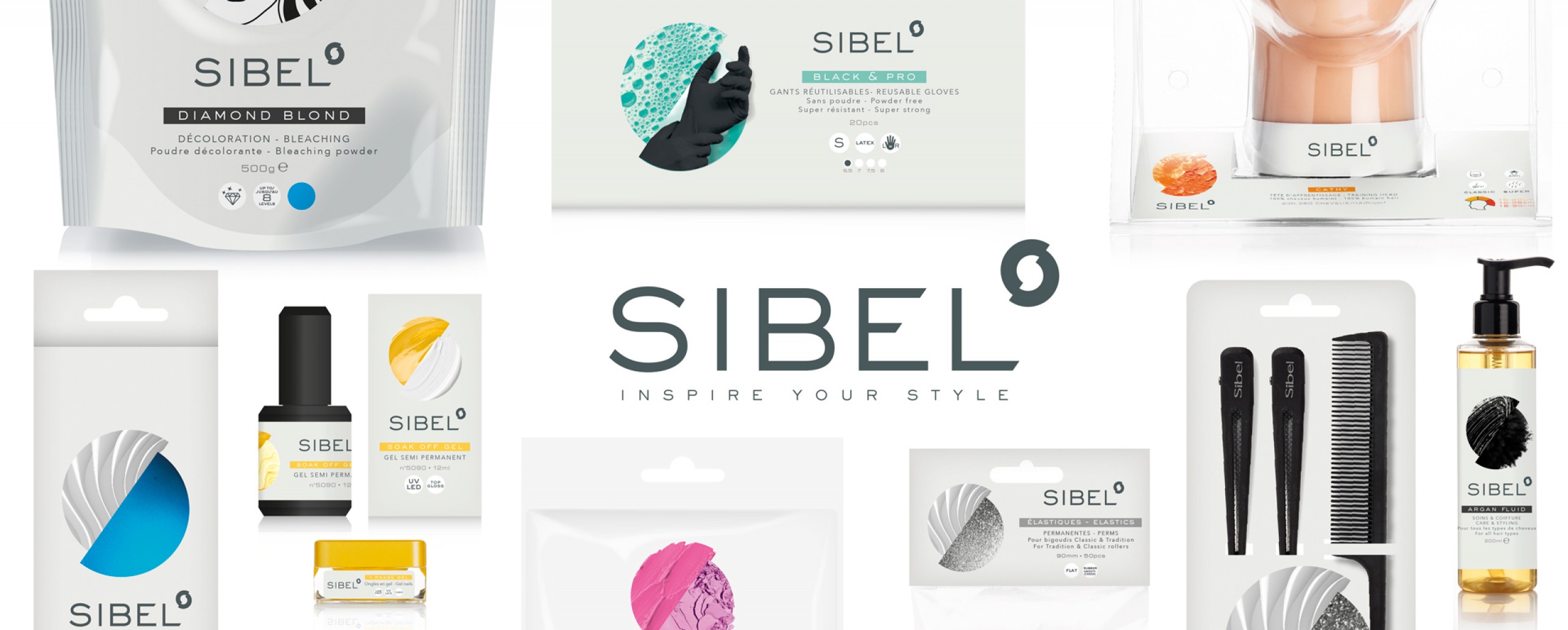
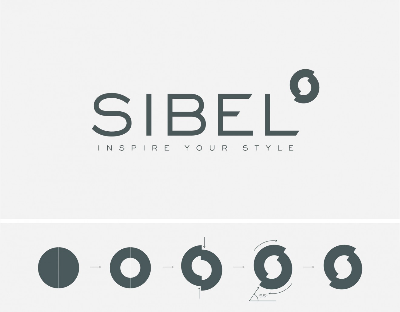
The new Sibel branding has a clean professional lettering and unisex typography style. We added a meaningful baseline to the brand which establishes the professional partnership between both brand and consumer. This is supported as well by the new branding symbol which symbolizes professionalism, partnership, balance and innovation. The core of the symbol reveals the Sibel ‘S with the shifted circle representing the two main Sibel subranges; HAIR & BEAUTY.
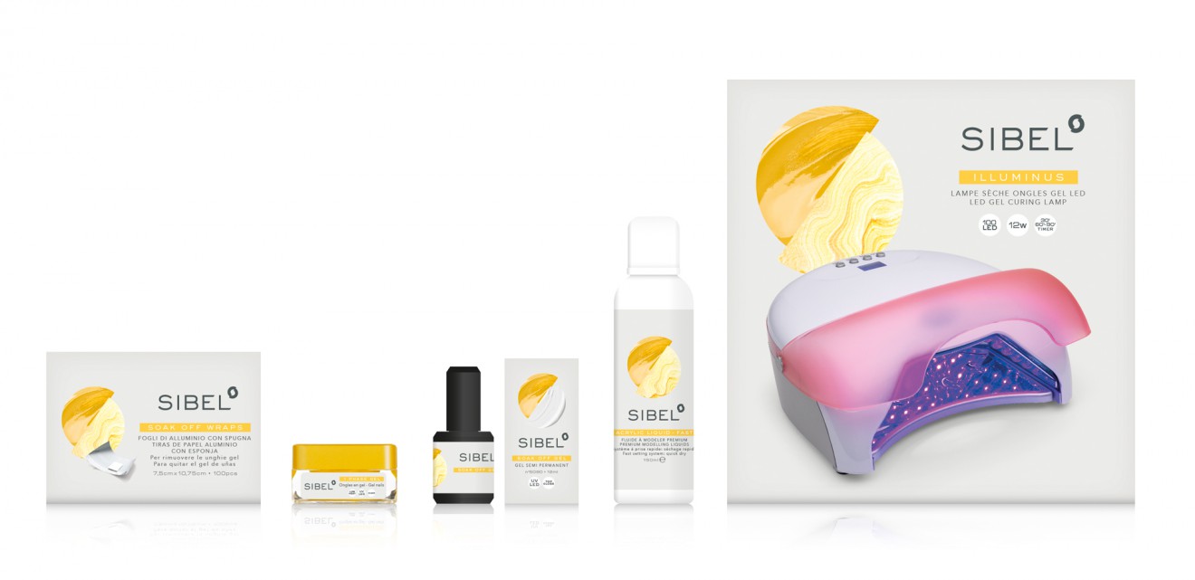
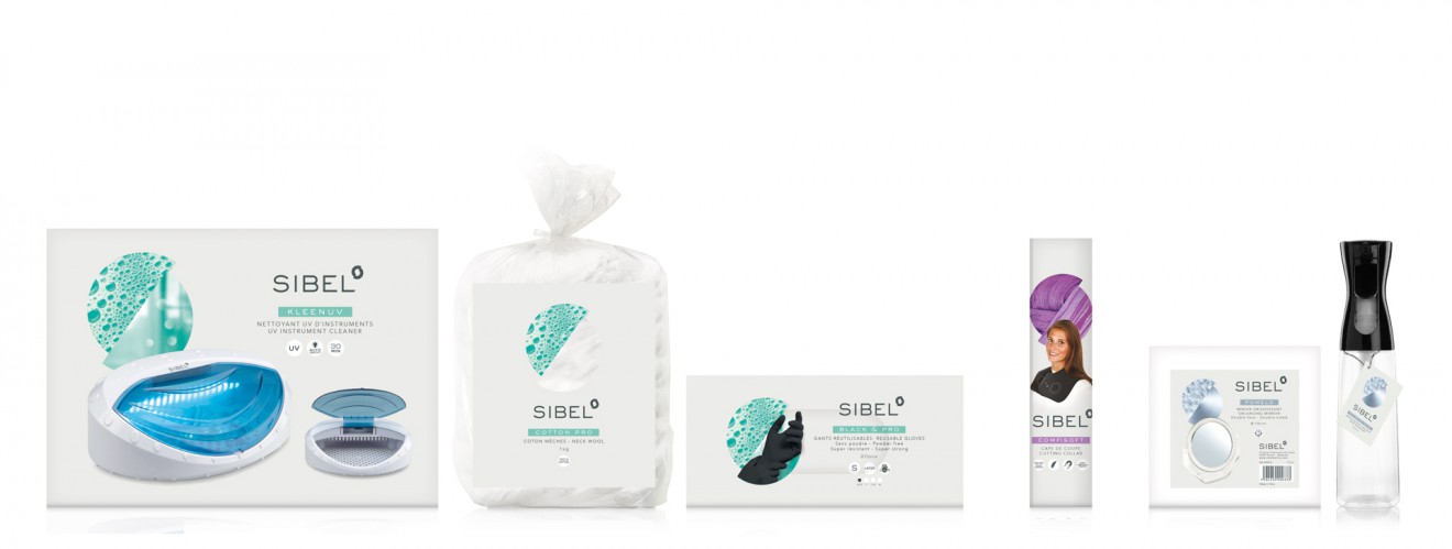
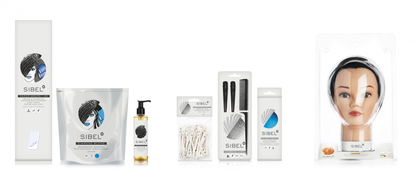
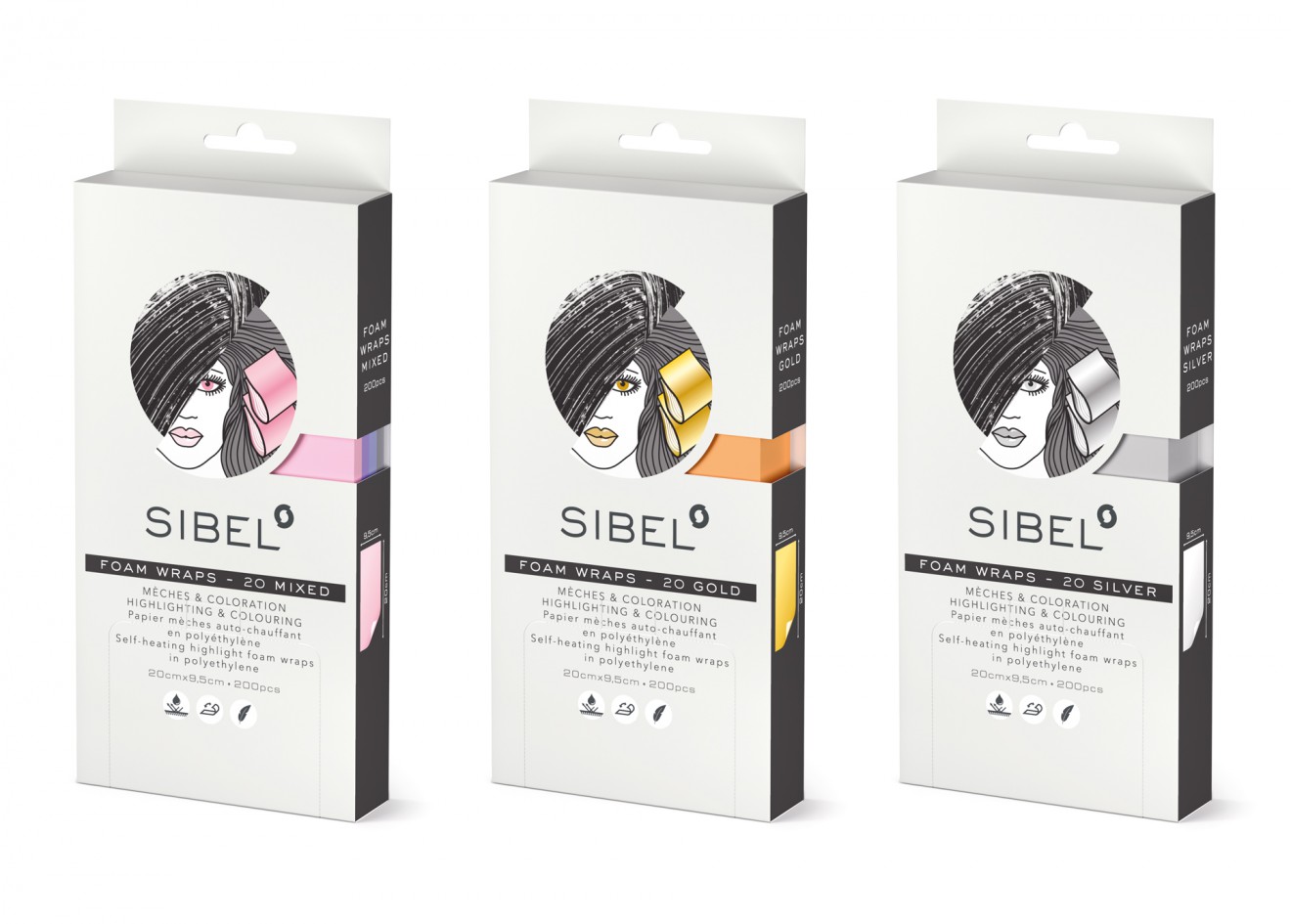
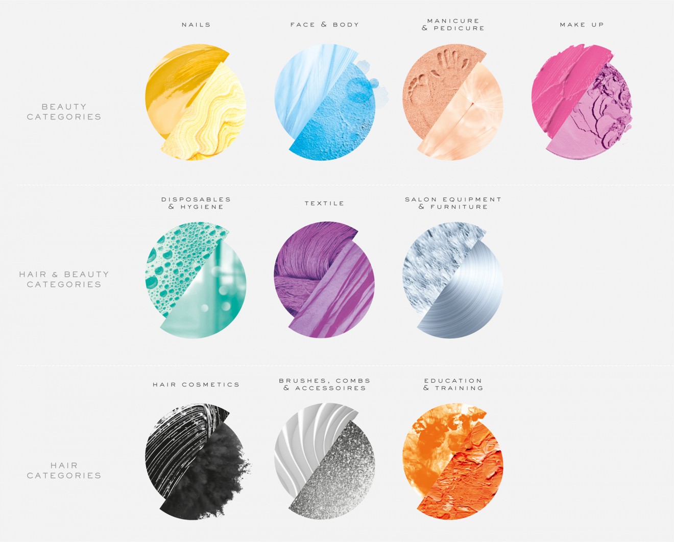
To connect all packaging in store and strengthen its uniformity we gave Sibel a unique, modern and uniform background colour we call the Sibel Grey. To highlight each of the 10 categories within the Hair & Beauty range we created a packaging device that is derived from the corporate Sibel symbol. Each category symbol is an inspirational abstraction of that specific category. They are all represented by their own colour to improve signalisation and range guidance in store. The category symbol is the focal point of the packaging hierarchy and is placed prominently on pack. It is a flexible element that can be altered to highlight important product related info. To guide the professional consumer all specific product information is placed in a clean, understandable and professional hierarchy.
The result is an impactful, qualitative and uniform branding and packaging identity that brings all Sibel products back into one family. A family that inspires, informs and connects professional consumers back to their beloved brand.
