Scroll downBack to overview
BRANDING & PACKAGING for Delhaize
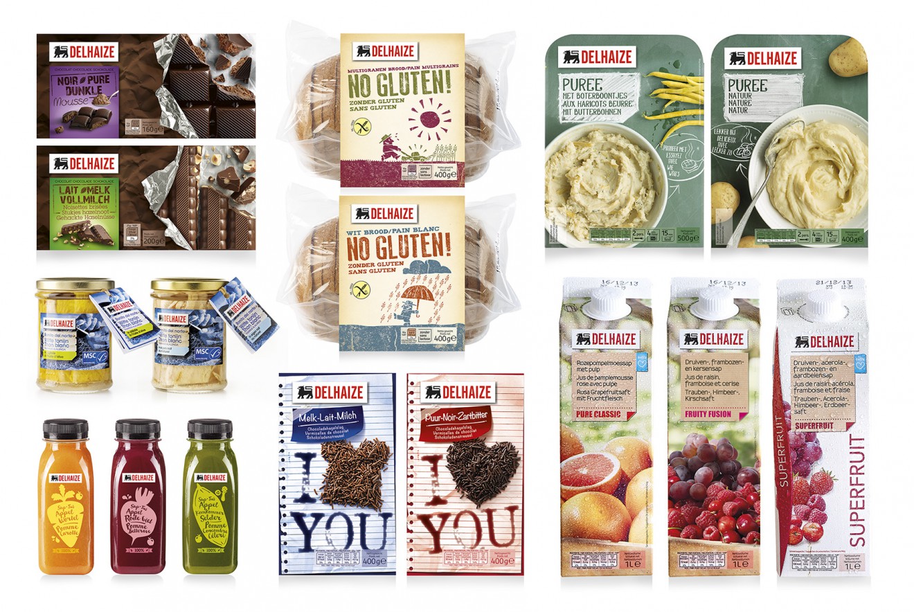
A brand architecture for the cross-category range of Delhaize
To create a qualitative look and a flexible architecture for Delhaize, a smart revamp was needed to emphasize on the proudness of the brand and the flexibility to dive into each specific category. By bringing back the roots of Delhaize into its logo, each packaging could finally emit the true values of the brand.
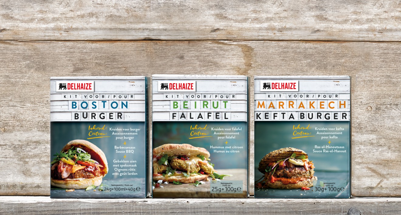
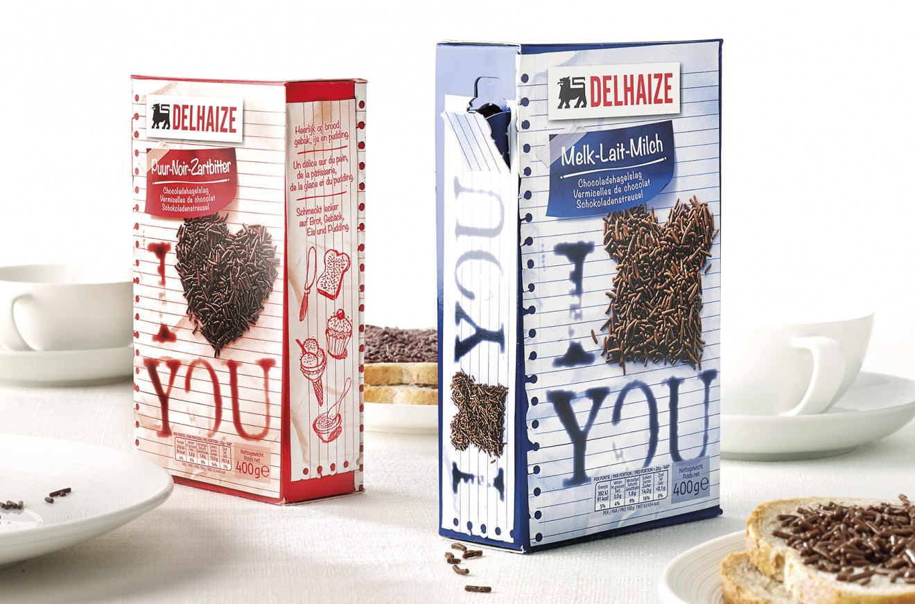
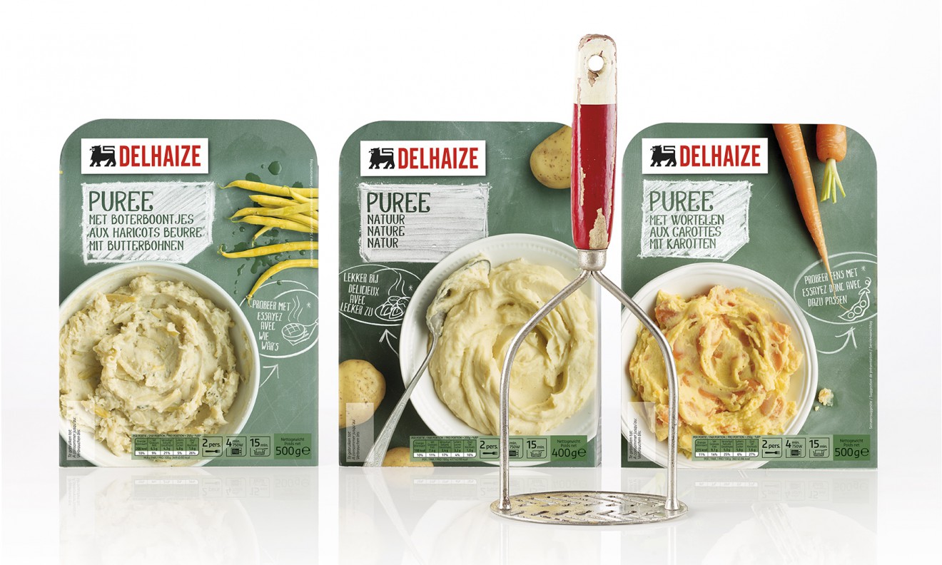
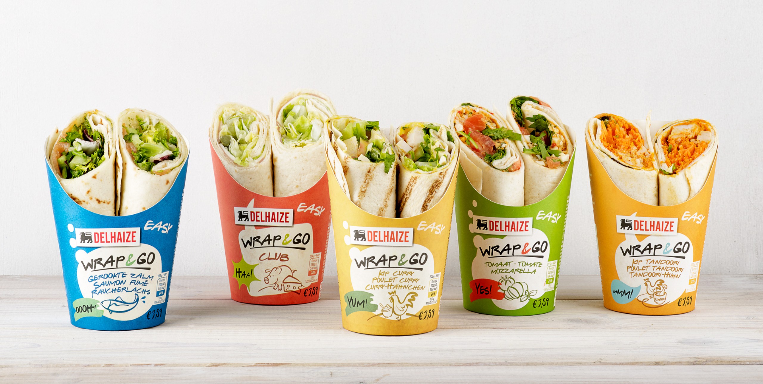
As Delhaize has always been a retailer with high standards and eye for creativity in its products, the design should meet its needs. The logo authoritative on top of the pack, combined with a fixed place for the product names make a strong focal point to communicate the brand identity and the product character at a glance. All the rest is creativity, instigated by the richness of each product.
